ESCADA Colors
CLIENT
ESCADA AG, Germany
ROLE
Art Director, Design Lead
SERVICE
Visual concept, navigation concept, UI/UX design
AGENCY / PRODUCTION
OPIUM
PROJECT INFO
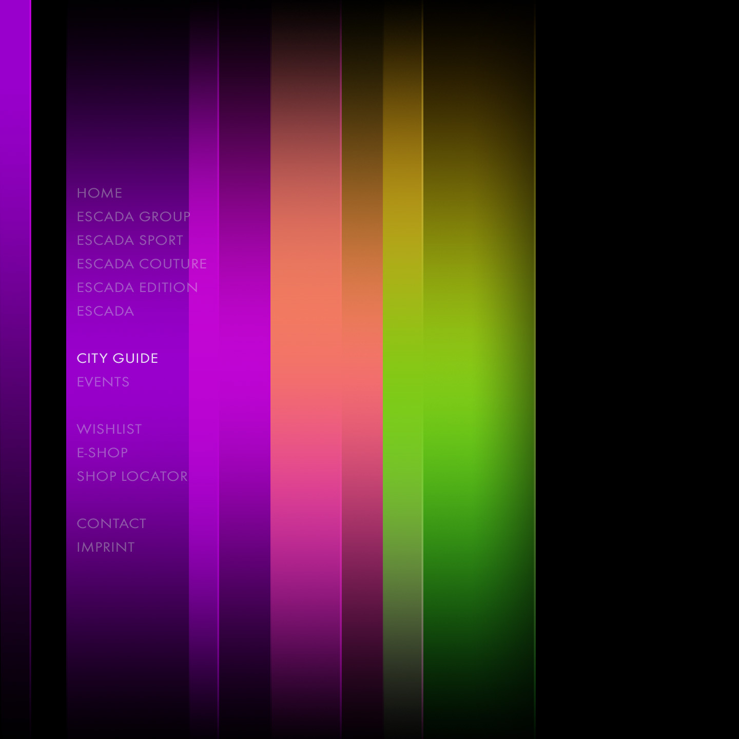
For the German luxury fashion company ESCADA, an innovative and self-explanatory design and navigation concept for web and mobile applications was developed. Based on the spectrum of colors as well as the different sublabels of ESCADA, the idea of a flowing horizontal and vertical menu navigation was implemented. The individual menu items are distributed on a color spectrum, which forms the background of the navigation. When selected, the spectrum is scrolled through to the corresponding color, thus forming an appealing color animation. The design-oriented approach is convincing due to its high aesthetic standards and a reduction to the essentials, which enables intuitive operation and underlines ESCADA's design philosophy.
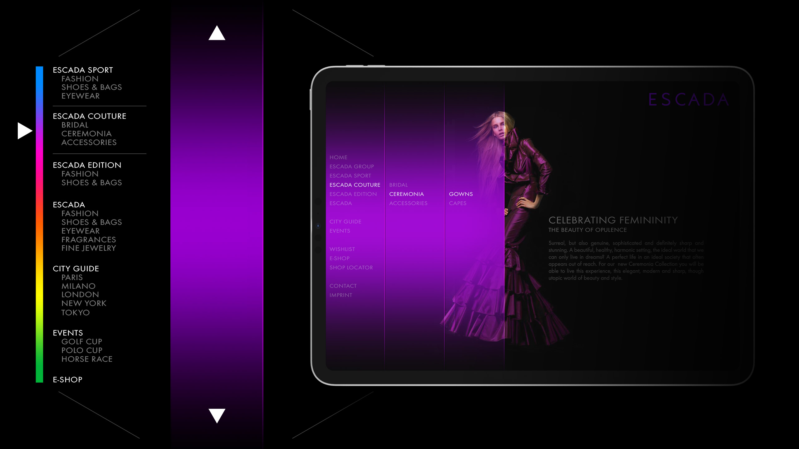
The unique navigation concept is based
on the spectrum of the colors
Every category is accessable on the navigation bar
and leads to the appropriate part on the color spectrum
Previsualization of navigation concept
in dynamic animation
Example of collapsed navigation bar
on ESCADA E-Shop site

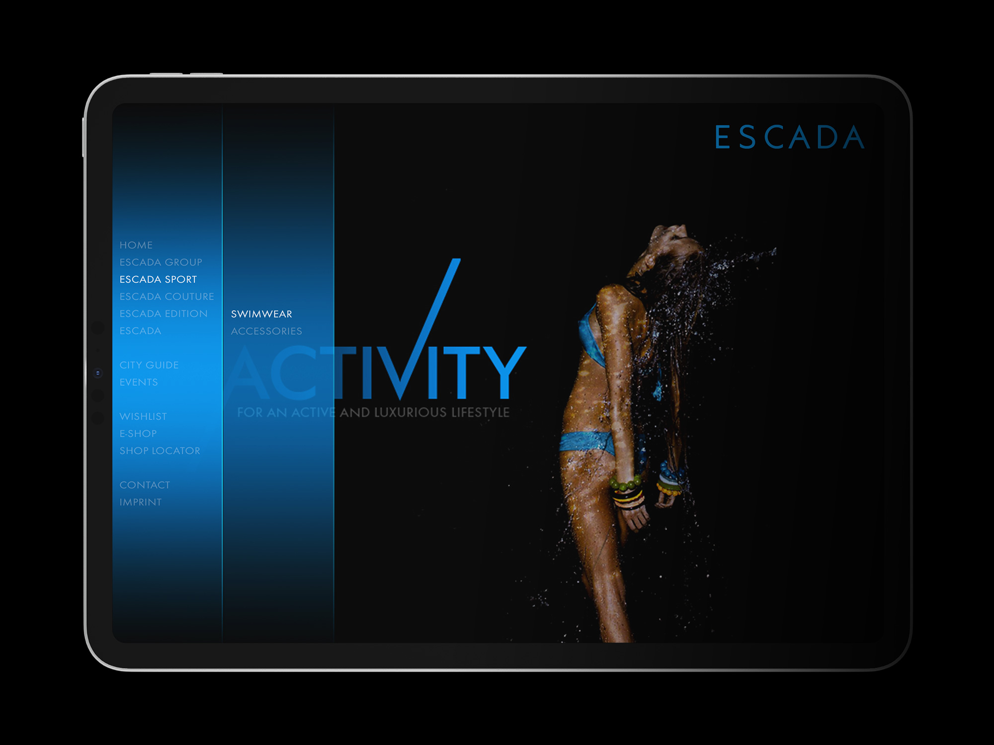
Example of slightly expanded navigation
on ESCADA Sport site to show sub navigation
Example of fully expanded navigation
on ESCADA Couture site to show sub navigation
